Cecilie Fritzvold is a LEGO builder from Norway whose artistic MOCs are currently featured in the LEGO House Masterpiece Gallery. She was also the winner of BrickNerd’s AdoraBuild contest. You can find more of her work on Instagram and Flickr.
Layers of a Landscape
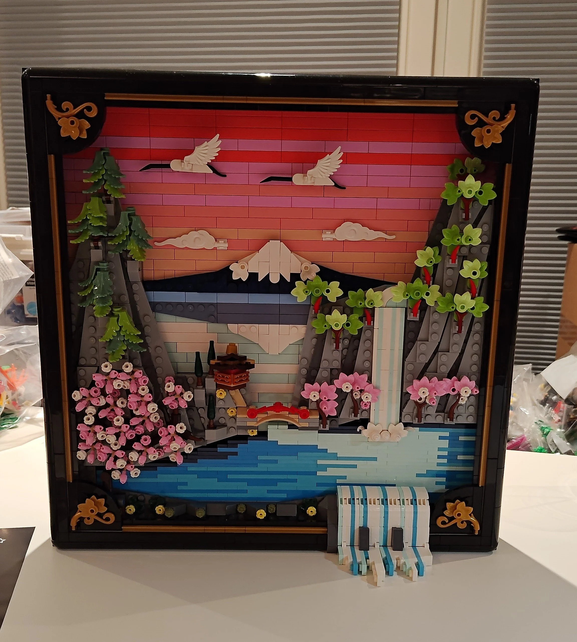
I consider myself primarily a MOC builder, and rarely build sets I buy (they mostly get gutted for parts). But when I was asked if I wanted to take a look at this absolutely gorgeous Japan-inspired artwork, I simply could not refuse. Anyone who knows me would understand why this is right up my alley. I even recently built a Japan-inspired forced-perspective MOC myself. So I was super excited to get to build LEGO’s Japanese Cherry Blossom Landscape.
The build starts off with the most boring part: the big black frame. Thankfully, it’s also a fairly quick build, using a lot of large black bricks to build volume fast. Once the frame and the base are done, the instructions move on to the actual fun parts.
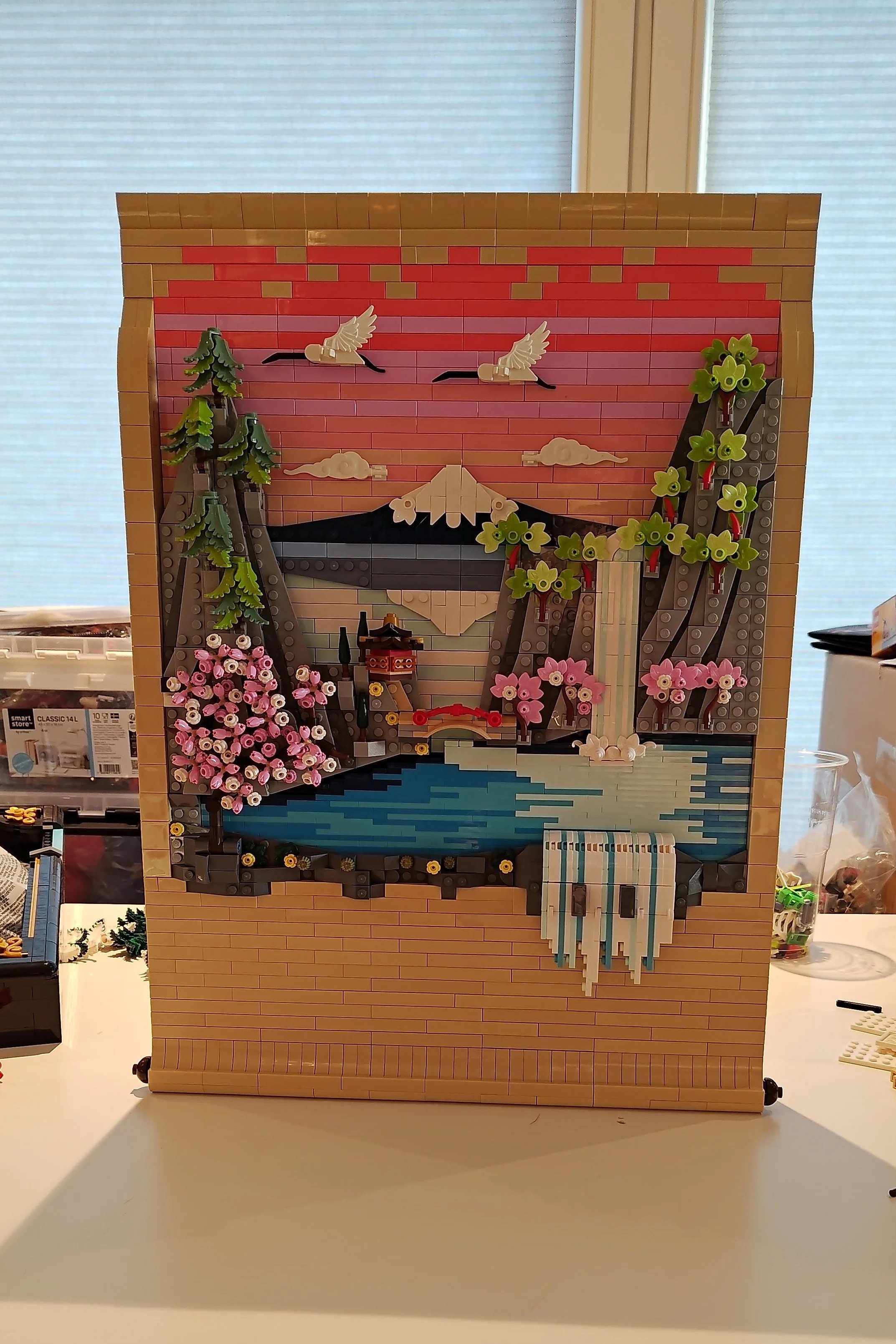
Building on the base felt like painting on a canvas, especially starting with the sky and painting it in all the shades of pink.
My favourite part of the build is probably the iconic Mount Fuji. It’s a simple build, but it’s precisely on point for what the real iconic Mount Fuji looks like, and it looks great the way it’s reflected in the water below. I also absolutely love those cranes flying in the sky, which have some nice NPU going with the black crowbars.
The mountains on either side are quite steep and frame the view of Mount Fuji between them. The fern pieces work really well to make those pine trees on the left.
Much better, I say, than when those same pieces are used for full trees rather than cutoff trees like here, because the branches are tighter together when fewer gaps are left by them having to go all around the tree.
Another highlight for me are the waterfalls that add some motion to the build, and I especially like the clever way a couple of feathers and some ice cream swirls add splashes where the water is meant to hit the lake.
A Few Gaps
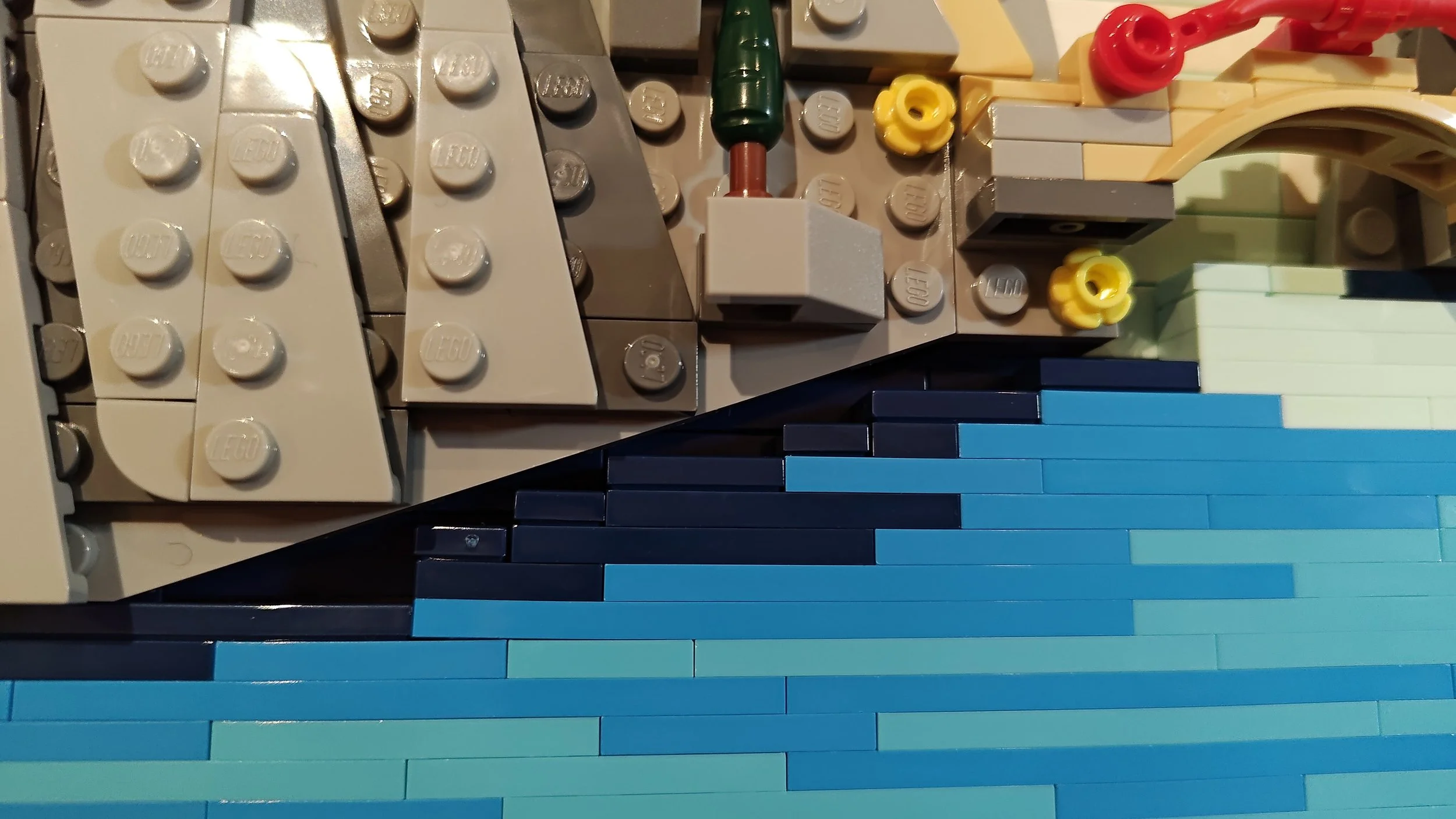
But I have to add a little criticism, because a thing that irks me a bit about the finished build is that there are some gaps that don’t get hidden by other parts.
A large one is on the left side of the lake, below the cherry tree. I feel like the edge of the water here could have been smoothed out by some slopes instead of leaving a “staircase” type set of gaps, or by having the wedge plates lay on top of the water to cover the gaps. Although the water at the edge is dark blue, when looking at the build from a distance (like you would if it’s displayed on your wall or on a shelf), it won’t really be something you notice or think about.
View fullsize
View fullsize
A gap that annoys me more is at the bottom of the waterfall, where a half-plate gap is left between the waterfall and the lake, which are built with studs in different directions. This gap is barely noticeable from a more top-down angle, but from a straight-on or lower angle, it’s very noticeable. I feel like it could have been either solved or hidden with a few extra splashes. There are other gaps as well, for example, at the top of the narrow waterfall, but those get hidden by foliage.
The Scroll Experiment
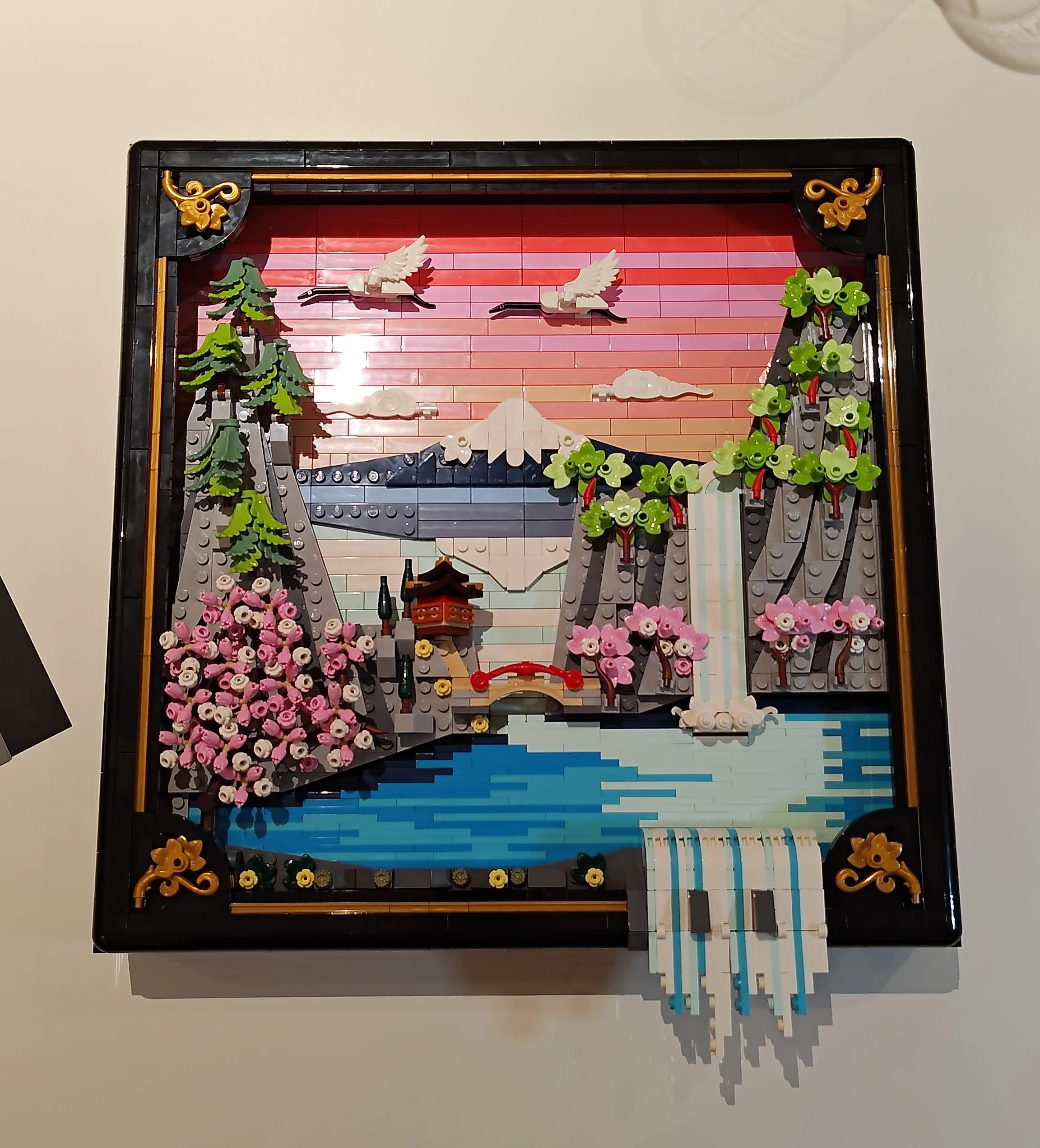
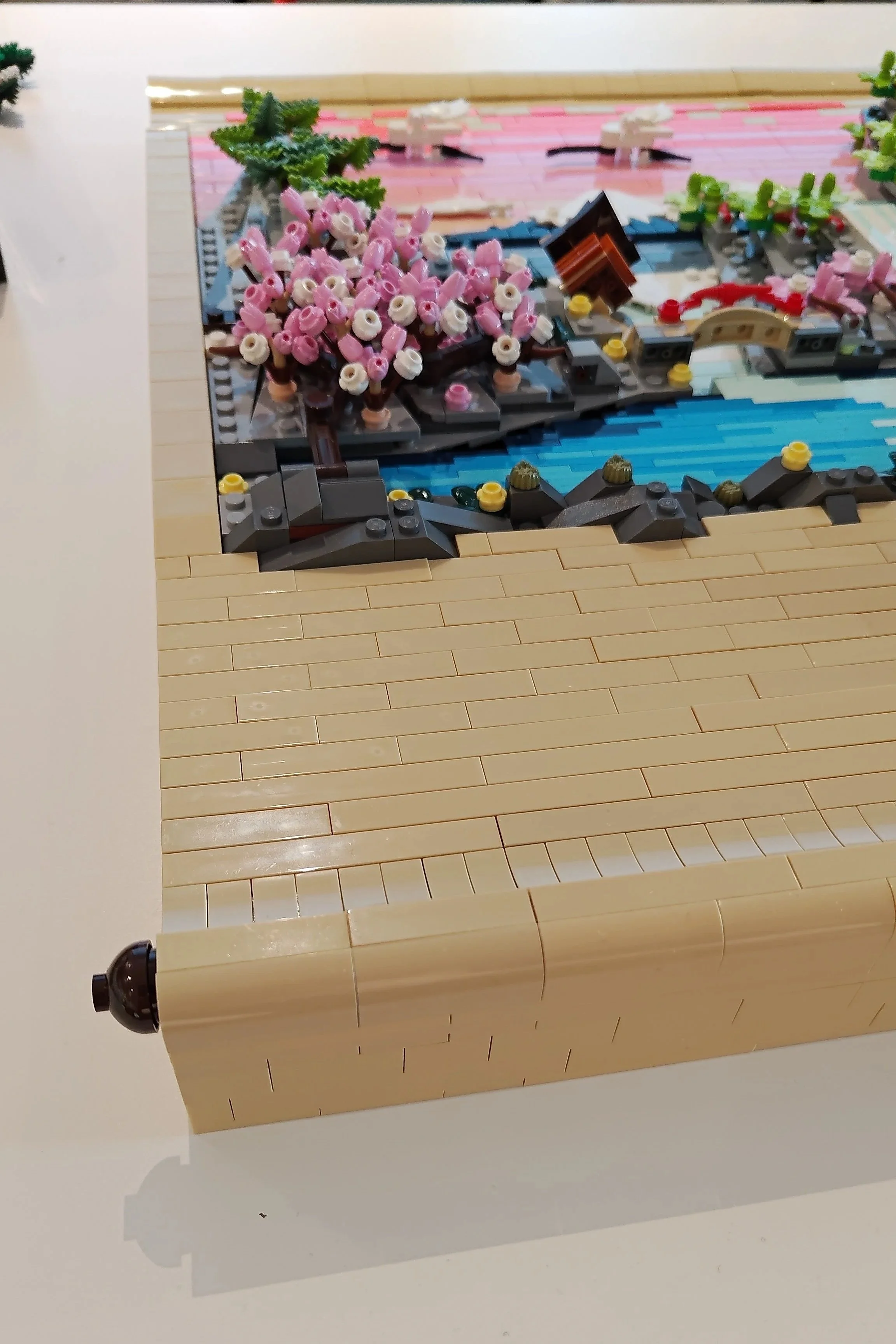
As a self-proclaimed Japan nerd, one thing that struck me when I first saw this LEGO Art was that it’s presented in a frame. Now, I understand why a frame was chosen. It does make sense to put a forced perspective artwork piece in a shadow box, and the lightweight frame helps make this a build that can be wall-hung.
But when I think about traditional Japanese artworks, I’m used to seeing those presented on hanging scrolls. In the instruction booklet, it even says that the artwork is inspired by Ukiyo-e artists, and when I look that up on Wikipedia to make sure I don’t say something wrong, I get confirmation that Ukiyo-e is from a time period in Japan when artwork was most commonly displayed on walls using hanging scrolls.
So I thought: is there a way to change the frame and present this forced-perspective build so it looks like it’s on a hanging scroll?
View fullsize
View fullsize
The black frame is easy to remove from the build, as it’s attached only by a set of axles pushed through from all sides to the base of the build. Once those are pushed out, the frame can easily be lifted off (just remove the overflowing waterfall first).
Next, I pulled out all my tan bricks and plates to build the foundation for my scroll-frame. Surprisingly, I was lacking a bit in that department (I guess I used it all up in some MOC, hah!). But the Van Gogh Sunflowers set else served as a helpful parts pack for this (I wasn’t going to build it anyway since I only bought it for some yellow parts I needed for something).
The hardest part was figuring out how to taper the side of the scroll so that it would be flush with the sky on top, but also with the lake at the bottom, while not being too low next to the mountains on the sides. In the end, I opted to just add some slopes and curved slopes right next to where the mountains start, adding depth to the build. It adds a visual “bump” to the scroll, which is a good reason the shadow box is a more logical framing choice for this build.
I also decided to let the sky on top and the rockwork in the bottom overflow into the canvas of the scroll, since it makes the waterfall overflow a bit less abruptly in this format than if all the other edges were straight.
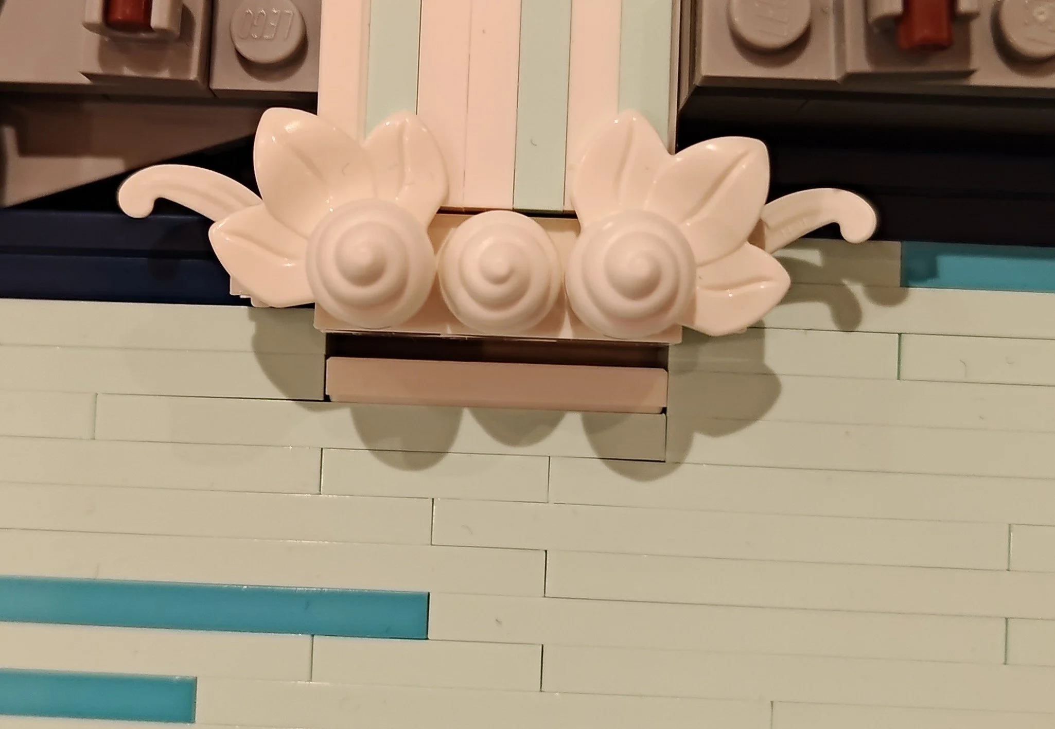
Another thing is that the designers didn’t detail the corners of the artwork since those were hidden by the curved corners in the frame, so I also had to make a few adjustments there to hide some parts that looked unfinished, such as adding some grey “rocks” to the brown 2×3 brick that served as a base for the cherry tree.
View fullsize
View fullsize
I added more slopes on the top and bottom to give the scroll some bars to roll around, a bunch of smooth tiles, and my scroll-frame was done! The shadow box darkens the inside a bit, while this scroll approach lets the build take in more light and thus look brighter.
The finished result is larger and heavier, but it can still stand up on its own as an alternative to risking hanging it on a wall (although the Technic pieces that provide the hanging option in the back do feel quite sturdy).
Changing Seasons
While I was building this scroll, I was also pondering the choice of season in this artwork. Spring is an obvious choice as the cherry blossoms are such an important part of Japanese culture, but autumn is also a very beautiful season in Japan, with a lot of strongly coloured autumn foliage.
So I looked up the types of trees that the designers chose for this build, which according to the instruction booklet are Japanese umbrella pines, Sango-kaku maples and Sakura cherry trees. A quick image search of those reveals that the cherry trees can have a very vivid orange autumn leaf palette, while the red-branched maple trees (yes, those trees actually have really bright red branches!) look gorgeous in fall with deep yellow foliage.
I wanted to see if I could change the artwork’s season just by changing the foliage on those trees. I also darkened the colours of the pine trees, in an effort to darken the scene as a whole to better represent the darker autumn season, and also because while pine trees stay green all year round, they do get brighter green offshoots in spring, which will have darkened to a deeper green in fall.
In the resulting autumn scene, the little red bridge now gets a little more lost due to its being close in colour to the reddish orange I used for the cherry trees. I’m also not convinced the pink sky works as well with this new palette, especially not against the bright light orange I used for the maple trees, so I would perhaps experiment a bit more with this if I wanted to keep it this way, maybe having a more yellow to red toned sky to better match with the foliage that is no longer pink and green.
Cooling the Palette
But what if one wanted a scene with a bit more muted colour palette? Both the spring and autumn scenes are quite vivid, and many artworks rely on a quieter palette, with only a few coloured highlights. The winter season would be perfect for this, so my next step was to try to make this into a winter scene.
Thankfully it’s very easy to switch out the foliage in this build, and being able to lift up the whole trunk for the cherry tree helps with replacing the bottom layer there. For this version, I gave the pine trees some snow, removing all the orange and yellow leaves and replacing them with white elements to represent snow. White flower stems and white leaves helped with this.
I also added some red minifig hands to give the maple trees more visible branches. Looking up images of those trees in winter revealed how cool they look with red branches with snow on them, so I wanted to try to recreate that effect. I also scattered some more white tiles here and there for more snow effects, and removed the splashes on the waterfall to make it appear more frozen. Frozen waterfalls are typically white with some light blue (we have a lot of those in Norway, so I would know), so the original waterfalls work just as well as frozen ones.
The result is definitely more muted, but like for the autumn scene, I would perhaps have made some more changes if I wanted to keep the scene this way, maybe have a dark night sky since the pink still steals a lot of the highlight that would otherwise now only be the red bridge and the maple tree branches and trunks, and maybe make some overall changes to the landscape to make it more snowy white.
A Summer Afternoon
Ok, I’ve done three seasons, but there are four seasons (and I am a completionist), so let’s do the summer season too! For summer, I put the pine and maple trees back to their original state, but switched the pink leaves on the cherry trees for bright green ones, adding some cherry elements in between, since a cherry tree is, after all, supposed to have cherries in summer!
Even though this summer scene has a less exciting palette overall, I actually like the balance of the colours in it, and surprisingly it’s even the version that I feel highlights the little red bridge the most. The pink sky also doesn’t pose any visual problems here and looks quite good with the green foliage, but it could be interesting to try a different colour for the sky in this scene as well, maybe a bright blue?
Scrolling Along
With that I will conclude my essay on this very gorgeous set, which I now have to decide which version I would like to keep on display. Or maybe I need to get three more copies of 31218 Japanese Cherry Blossom Landscape so I can have all seasons displayed next to each other?
Although I don’t think I am going to bother building three more scroll-frames… but maybe with four I could present them in another traditional way Ukiyo-e artworks were displayed: folding screens. To be continued…
LEGO Art 21064 31218 Japanese Cherry Blossom Landscape is available for around US $140 | EU €120 | CA $180 | UK £100 | AU $200.
DISCLAIMER: This set was provided to BrickNerd by LEGO. Any opinions expressed in this article are those of the author.
Have you ever removed details from a build and found that it actually made the story clearer? Let us know in the comments below.
Do you want to help BrickNerd continue publishing articles like this one? Become a top patron like Marc & Liz Puleo, Paige Mueller, Rob Klingberg from Brickstuff, John & Joshua Hanlon from Beyond the Brick, Megan Lum, Andy Price, Lukas Kurth from StoneWars, Wayne Tyler, Dan Church, and Roxanne Baxter to show your support, get early access, exclusive swag and more.
Leave a Reply